


Credits

Amit Pathania

Md Shahanab Uddin
Founded
2014
Location
Mumbai, India
Company size
11-50
Industry
Email marketing software (WordPress plugin)
Capabilities
Product

Icegram Express is an email marketing plugin that lives inside WordPress. Bloggers, creators, small businesses and WooCommerce stores use it to collect subscribers, send newsletters and automate follow-ups without leaving their dashboard. It has been listed on WordPress.org since May 2014 and, as of 12 October 2026, has 50,000+ active installs and a 4.6 out of 5 rating from 1,170 ratings.
By early 2025 the product had grown for more than a decade. Our February 2025 audit found that a new user met a three-step setup form before seeing the product, the audience screen showed everything at once, and workflow templates sat in a separate tab. The features were all there. It was just hard to know where to start.
Icegram asked Rango to redesign the product experience: the onboarding, the dashboard and the everyday screens behind them.
At a glance
Product: Icegram Express, a WordPress email marketing plugin (earlier known as Email Subscribers & Newsletters)
Design partner: Rango, for the UX audit, the product redesign and the design system
What we designed: onboarding inside the dashboard, the main dashboard (with pre-built workflow previews), campaign creation (start picker, checklist editor), a three-step form builder, the audience dashboard and the design system behind them, all inside the WordPress admin
Where it runs: inside the WordPress admin. WordPress.org lists 50,000+ active installs of the plugin
Timeline: UX audit and redesign direction in February 2025, designs completed around May 2025, and the redesigned screens released in stages from 29 August to 11 November 2025 (versions 5.9.0 to 5.9.10)
Built by: Icegram’s engineering team, who tried generating the front-end code from the Figma screens and shipped every release
Front end: a React app built by Icegram with shadcn/ui components (Radix UI and Tailwind CSS), live since version 5.9.0
The brief
Two minutes to draft a campaign.
Icegram describes Express as beginner-friendly and built for bloggers, small businesses and online stores: people for whom email is one job among many. So the brief set five principles:
Simple, informative, quick. Drafting a campaign should take less than two minutes.
Features at the moment they’re needed, not in a tour on day one.
A clearer visual design across the product.
One design for two homes: the WordPress admin today, and a standalone web app later.
AI where it shortens a journey, the way the best products in the category already do.
We also asked the questions that shape a product, not just its screens: where the product earns its revenue today and tomorrow, whether workflows should be built like Mailchimp’s or kept simpler, and whether the redesign needed its own design system or had to follow existing rules. The screens reflect those questions: upgrade prompts sit next to the workflows they unlock, workflows start from popular templates, and Icegram got its own component system.
Designing inside WordPress
The hardest constraint was where the product lives.
A standalone web app owns its whole screen. Icegram Express doesn’t. It renders inside the WordPress admin, below WordPress’s own toolbar and beside its menu, sharing the page with notices from whatever other plugins a site runs. WordPress’s admin styles reach into every plugin screen. And no two installs are the same: each site has its own mix of themes, plugins, browsers and hosting.
That changes what good design means. A screen has to stay clear with someone else’s banner above it and work whether the WordPress menu is expanded or collapsed. It has to feel like one product across every page, even though WordPress, not Icegram, owns the frame around it. And the same design had to be ready to leave WordPress one day and run as a web app.
How we designed for it: Icegram got its own component system, so cards, tables, buttons and status badges look the same on every screen, whatever sits around them. Each screen keeps its primary action in the same top-right spot, Icegram’s sections sit under a single entry in the WordPress menu, and announcements live in one dismissible banner. The same components are meant to move to a web app with the product.
The audit
We started with the screens users actually see.
Our audit covered the five main flows (onboarding, audiences, forms, campaigns and workflows) and noted where each one slowed people down:
Onboarding asked for a sender name and a test email in a three-step form, then left new users on a dashboard that did not say what to do next.
Audiences packed too much onto one screen. The contacts table did not surface status or engagement scores, importing from other tools was harder than it needed to be, and exporting meant all contacts or nothing.
Forms were a plain list with previews too small to read, and the shortcode was easy to miss.
Campaigns had no way to see what was planned and when, and the table buried the numbers that matter.
Workflows kept their templates in a separate tab, away from the moment someone wanted to automate something.
For imports and workflows, the audit used Mailchimp as the reference, and it asked for better empty states throughout.
Each finding came with a suggested fix. Two ideas run through everything that follows: setup happens on the dashboard itself, with a real first task such as creating a campaign, and each screen leads with the one thing people came for, such as a form’s shortcode.
Note: a few audit findings, like a campaign calendar and list-by-list exports, sit outside the screens in this case study.
The redesign
One primary action per screen.
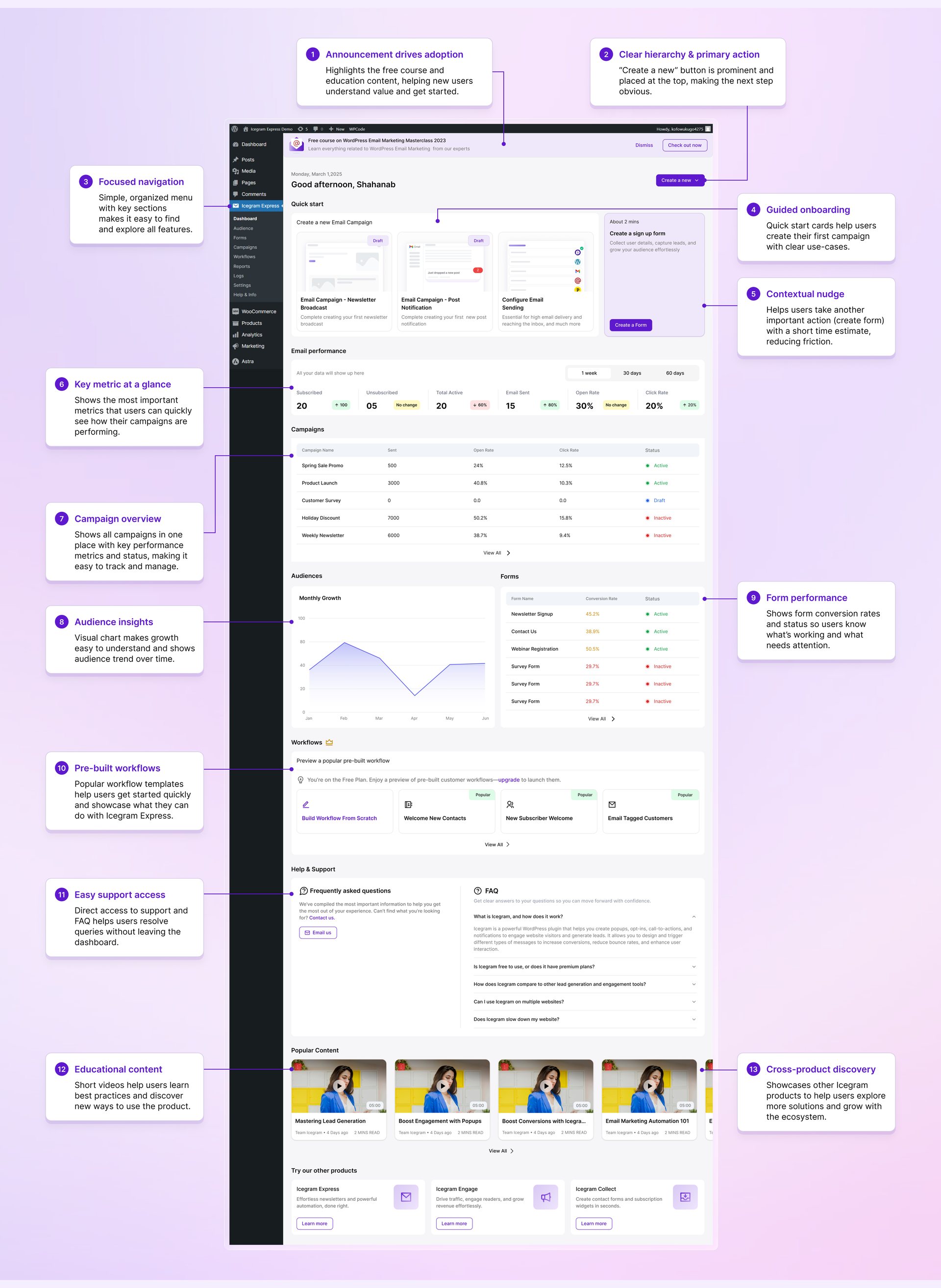
The new dashboard, annotated: 13 design decisions, from the primary action at the top to other Icegram products at the bottom.
Thirteen decisions, top to bottom. Each callout in the design file says what an element does and why it is there:
Announcement banner. One dismissible banner promotes the free email marketing course, so new users see the value before they start.
One primary action. A “Create a new” button at the top makes the next step obvious on every visit.
Focused navigation. Every Icegram section sits under one entry in the WordPress menu, easy to find without crowding the admin.
Guided onboarding. After a greeting with the user’s name and the time of day, quick-start cards begin a first campaign from a real use case: a newsletter broadcast, a post notification, or setting up email sending.
Contextual nudge. A card suggests the next important task, creating a sign-up form, and says it takes about two minutes.
Key metrics at a glance. Subscribers, unsubscribes, active contacts, emails sent, open rate and click rate, each with its change, over 1 week, 30 days or 60 days.
Campaign overview. Every campaign in one table, with sends, open rate, click rate and status.
Audience insights. A monthly growth chart shows the audience trend over time.
Form performance. Each form shows its conversion rate and whether it is active, so users see what works and what needs attention.
Pre-built workflows. Popular templates, such as a new subscriber welcome, show what the product can do. On the free plan they can be previewed, with an upgrade to launch them.
Support in place. FAQs and a direct email link answer questions without leaving the dashboard.
Learning content. Short videos teach best practices and new ways to use the product.
Other Icegram products. A last row introduces Icegram Engage and Icegram Collect.
First-time users see a different top to the same dashboard: a setup checklist with progress (send a first campaign, import contacts, send a newsletter, create a workflow or form), a three-minute video overview and a reward for finishing. It turns the audit’s idea, onboarding through a real first task, into part of the dashboard.
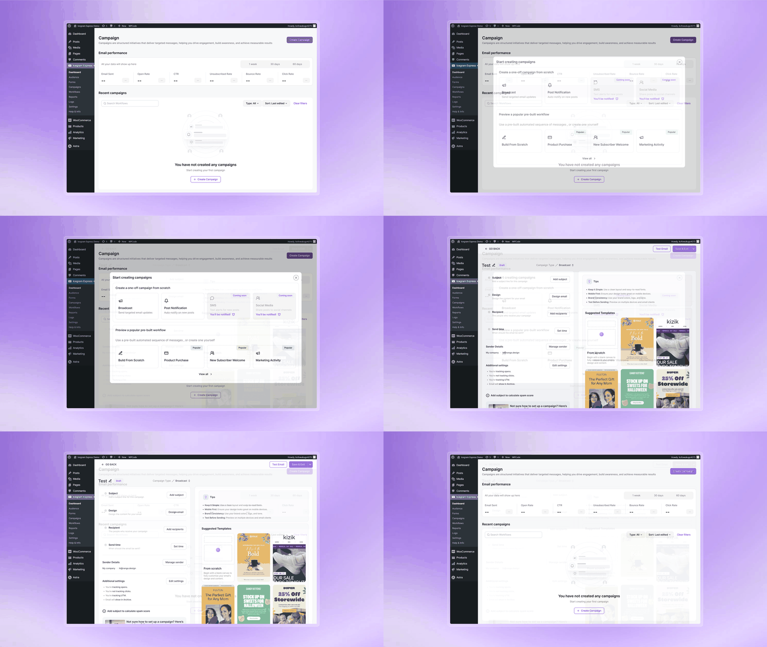
The campaign flow: an empty list that leads to the first campaign, a start picker, then the editor as a checklist with suggested templates.
Campaigns start from a choice, not a blank page. An empty campaign list leads straight to creating one. The picker offers one-off campaigns, such as a broadcast or a post notification, next to pre-built workflows. The popular labels follow an idea from the audit: show new users what many others choose for their first campaign.
The editor works like a checklist. Subject, design, recipients and send time each have one button, sender details and tracking settings sit below, and tips and suggested templates stay in view. A spam score appears once a subject is added. Four decisions with one button each is how the design works toward the brief’s two-minute target.
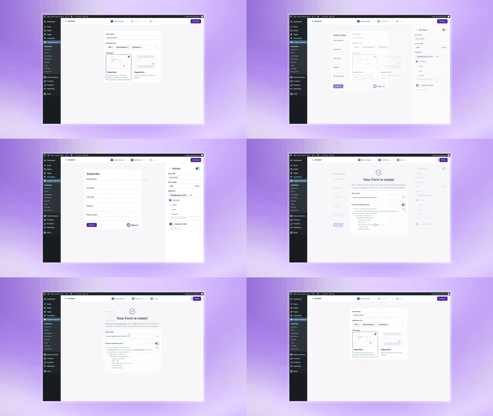
The form builder: name, list and type, then fields and settings, then the shortcode and embed code, ready to copy.
Forms in three steps. Name the form, choose the list it feeds and pick inline or popup. Set the fields and settings, with the form shown full size as you edit it and options such as its width and a redirect after sign-up beside it. Then a “Your form is ready” screen presents the shortcode and embed code, ready to copy. The audit had found previews too small to read and the shortcode easy to miss. This flow answers both.

Audience growth, smart insights and a health score come first.
Audiences: fewer numbers, clearer ones. Growth, smart insights and an audience health score come first, then subscribers by country and the newest contacts. Insights turn data into a next step, such as a note that the unsubscribe rate is above average with the reason one click away, and the health score comes with a tip like verifying emails to cut bounces. The contacts table the audit found too plain now shows each contact’s score, lists, email status and when they last opened an email.
The design system
Built to outlast the redesign.
Icegram ships an update every week or two (on average every 11 days between versions 5.9.0 and 5.9.38), so the product keeps changing long after a redesign. That is why the work included a design system: foundations for color, typography and grids, then base components such as buttons, inputs, forms and pop-ups, built to hold up inside the WordPress admin and to move to a web app later.
In practice that meant a small set of patterns repeated on every screen: metric cards that show their change over time, tables with a status badge on each row and a View All link, cards for templates and quick starts, and empty states that point to the first action.

Interface cards from the redesign.
What shipped
Built by Icegram, released in stages.
We completed the designs around May 2025, when AI was starting to bring design and code together. Icegram Express was the first product where Icegram’s team tried generating front-end code from Figma screens, and they built the interface with shadcn/ui, an open-source set of React components that a team copies into its own codebase. The engineering was theirs alone: Icegram’s engineers built the new screens and released them one area at a time. From the WordPress.org changelog:
29 August 2025, version 5.9.0: a revamped dashboard with better navigation, AI suggestions and helpful stats
5 September 2025, 5.9.2: dashboard improvements and a subscriber growth chart
16 September 2025, 5.9.3: an enhanced forms dashboard, with ready-made templates or forms built step by step
23 September 2025, 5.9.4: “Simplified onboarding so you can focus on what matters most”
7 October 2025, 5.9.5: “Revamped Audience Dashboard UI for clearer insights”
16 October 2025, 5.9.6: “Revamped Campaign Dashboard UI for a more modern and intuitive experience”
Version 5.9.10, released on 11 November 2025, introduced the revamped campaign editor.
Note: the change is visible in the plugin’s public code. Version 5.9.0 replaced the old PHP-rendered dashboard with a React app built from shadcn/ui components, which sit on Radix UI and Tailwind CSS. By version 5.9.38 the same app runs the dashboard, onboarding, audience, campaign, form, workflow, report and settings screens, including the reports and settings pages Icegram’s team redesigned on its own.
The result
Released in under three months. The redesigned screens went out between 29 August and 11 November 2025, from the first dashboard release to the campaign editor, all built by Icegram’s engineers.
Delivered as routine updates. Icegram released the new screens through ordinary plugin updates, inside the WordPress admin its users already work in.
What users say. As of October 2026, 20 of the 21 WordPress.org reviews posted since the first redesigned release give five stars. One, from May 2026, singles out the interface: “The interface is clean, easy to use, and saves a lot of time.” (WordPress.org review)
In the new design, a first-time user gets a clear next step instead of a setup form, and the everyday screens lead with what people need to act on.
What other product teams can take from this
Move setup into the product. Put the few settings a new user needs on the dashboard itself, then lead straight into a real first task, like drafting a campaign.
Keep the main action in one place. Inside a host platform like WordPress, the frame around your product changes from site to site. A fixed spot for the primary action is what stays familiar.
Put upgrades next to the value. A preview of a pre-built workflow, with an upgrade to launch it, shows what the paid plan does before asking for it.
Design in components when engineers build from your files. Rango’s files repeat the same cards, tables and badges on every screen, and Icegram’s engineers built the interface from shadcn/ui components, so both sides worked in reusable parts.
“We were truly impressed with Rango’s work. The combination of thoughtful UX, clean interface design, and a strong understanding of how the product is actually used made a real difference. It’s rare to find a team that can bring together design, functionality, and product strategy so seamlessly.”

If your B2B SaaS product has outgrown its interface, see how we approach web app design.
Share on
Previous
Next